
We have a door to nowhere, as many new-home owners may have. You know the one... the pretty sliding doors that look out into the backyard... with the big ugly white gate stretched across it since the door is a story above ground!
We have no deck or stairs or anything outside that door... yet. {should've bought a Mega-millions ticket... I KNOW I would've been a winner.}

Here is a shot of the doors when I hung up 40th birthday cards for my husband. Those are simple brown curtains... nothing fancy. Sort of "blah".
So, rather than let that door sit there, bare, we have dressed it up a bit since it's on a big open wall.

After we painted the walls cream, it was time to address the problem of all-solids in our main floor.
We bought these super sweet curtains at Target for just $20 a panel. They are "Tan Henna", in case you are curious. Since they are not lined, I simply attached them to the clips over the other brown curtains. Perfect! It gave the panels some more fullness AND the ability to darken better. (The afternoon sun can be blinding through those doors!)
I made this sign. SUPER easy, thanks to some directions on the Nate Berkus Show

I simply bought a 6' length of 1"x6" select pine (I wanted a very flat piece of wood.)
I painted it a dark gray (used up some extra paint from the office walls) in two coats. Then I printed off the letters on my printer. I lined up the letters on the board and traced them all, adjusting for better spacing when necessary. When you trace the letters with a ballpoint pen, the wood becomes indented.
After the tracing, I used some craft-store acrylic paint in sand-color to fill in the letters with a brush. Next time I'll get a smaller brush, since it was tough in some areas, but that was my fault for being too impatient to wait to get a new brush.
The sand colored paint was a little gloppy in some areas and sparse in others, but I figured I was going to roughen it all up, so I wasn't concerned. After the words dried, I pulled out a sanding block and roughed up the surfaces and corners and edges a bit. Since I didn't paint two different colors, the sanding sometimes revealed bare wood. So, I darkened the edges and the surfaces by rubbing the Distress Ink pad all over the sign lightly. It picked up the corners easily and gave a bit of an aged look to the rest of the sign.
After the Distress Ink dried, I sprayed the entire sign with a coat of acrylic sealer.

Sorry I forgot to take step-by-step photos. I was so giddy to get this sign done after we finally agreed on a phrase to go on it!
Guess how I hung it up?

I put one on each top corner and one in the middle ... each with two nails to be a little more secure.
To fill in the empty walls on other side...

I added a few frames. I bought the frames at HomeGoods for $4 each... they were in the clearance area and were two different colors, but after repainting them and distressing them, they work! Here are my girls.

And here are my boys.
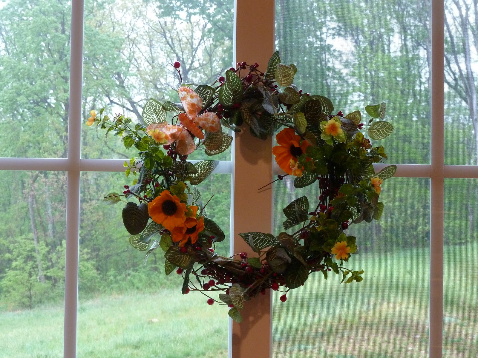
I had a simple red berry wreath on the doors, but I decided it wasn't very springy, so I added a few little doodads and leaves I got at Michaels yesterday.
I added another panel to my kitchen window, in order to match. They didn't offer any other sizes and/or valances in this print, so we just bought another panel.
I inserted the tension rod, pinned the bottom part of the panel to the top with four safety pins, wrapped ribbon around the top and bottom and tied two pretty little bows. Wah-lah... quick and easy valance from a full 84" panel!

Now that the room's walls are all prettied up with new wooden plaques and new dressed-up door, I think our breakfast room needs just one more thing....

Um... a table?
Looks beautiful Christy! On that Etsy question that you asked....I would pay for Cricut lettering and anything distressed.
ReplyDeleteLooks great! Also, in response to your Etsy question, I think cool signs with great sayings is a good idea!
ReplyDeleteOh My Gosh Christy, your something else, I really wish we lived closer. You inspire me to do things too. Keep up the great work. Keep us posted.
ReplyDeleteSuper job - need new curtains for my kitchen - got any great ideas?
ReplyDeleteGorgeous!! Love the distressed picture frames and sign!!
ReplyDeleteI LOVE those curtains--I look at them EVERY time I go to Target! I think that color *might* be too close to my wall color so I may have to look at the darker ones, but now I'm definitely going to DO it! And THANK you for showing your window over the sink! I've been struggling with what to do with mine and how to used the same curtains--and you just solved my problem!
ReplyDeleteGreat! We were torn between the tan and brown ones, too. I'm glad for us I went with the lighter one... seems to work well with our muted colors in there. Good luck on the curtains!
DeleteOh, and if anyone else is going shopping for curtains at Target, there's a coupon on their website...buy one panel, get one half-off!
ReplyDeleteJust a little update...those curtains you used work PERFECTLY in our bedroom! Thanks again, for enabling me! LOL!
ReplyDelete